tswd-portfolio
| home page | visualizing debt | critique by design | final project I | final project II | final project III |
Assignment: Visualizing government debt using Tableau
Web Link: https://davidzouz.github.io/tswd-portfolio/visualizing-government-debt
Part 1: Working with web-based visualization tools and data
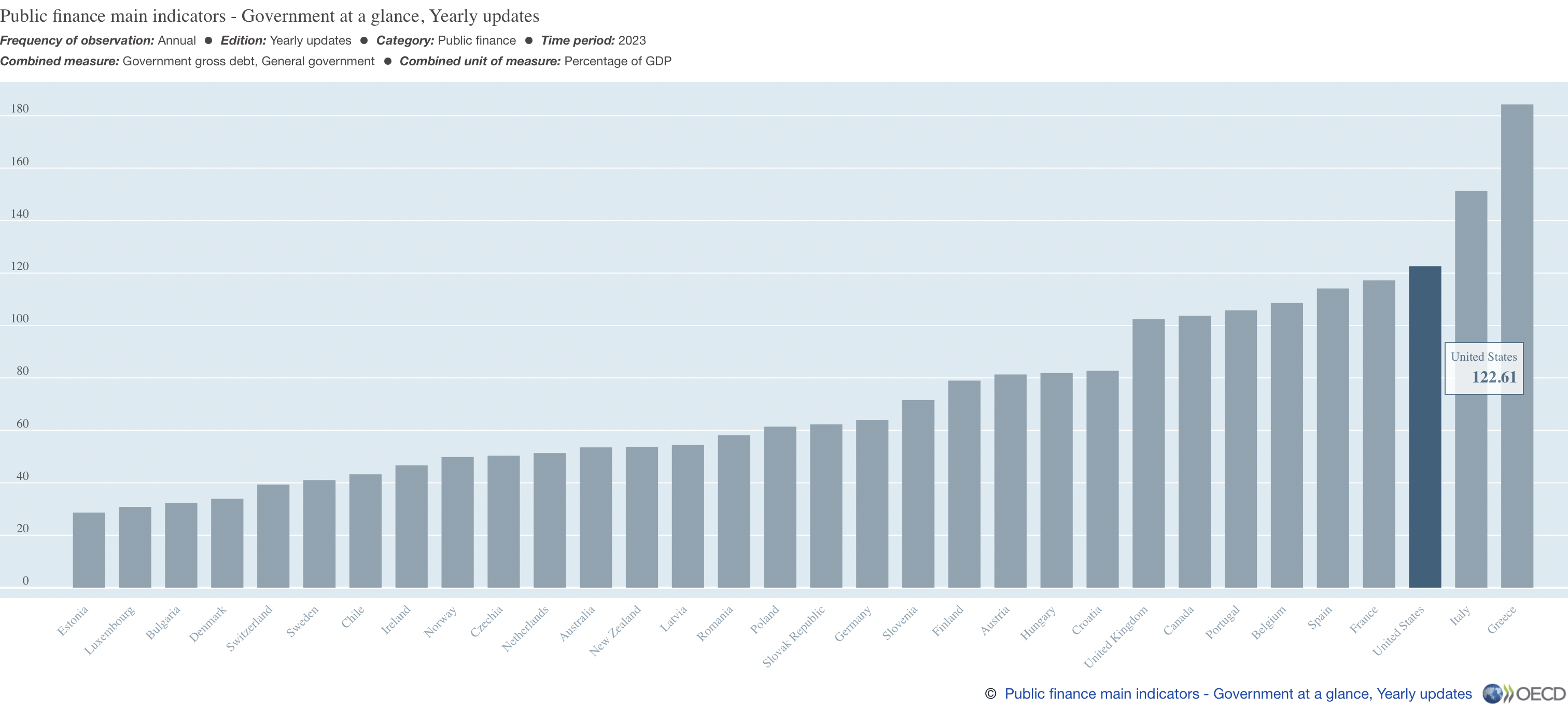
Online Visualization: https://data-viewer.oecd.org?chartId=ebdfc227-57ba-42ec-83e0-ad2243ad4d1d
What I did: I selected the 2023 as the single year for governments debt-to-GDP ratio graph. This chart displays the gross government debt as a percentage of GDP for various countries in 2023. The countries are listed along the horizontal axis, while the vertical axis represents the percentage of GDP. The United States is highlighted with a debt ratio of 122.61% of GDP.
Part 2: Working with Tableau

The chart shows the Debt-to-GDP ratio in percentage with Location as the Rows and Year(Times) as the Columns with SUM(Value) as the Text and the Color sections, making it to the following Heat Map. The more the number goes toward orange, the higher the number; on the other hand, the lower the number, the more its color goes toward Dark Blue.
Part 3: Create your own visualization
1. Bubble Chart - Avg. Debt-to-GDP Ratio by Countries:

This is a bubble chart where each circle represents a country, and the size of the bubble corresponds to the average Debt-to-GDP ratio.
The colors distinguish countries, while the bubble sizes visually indicate how high or low the Debt-to-GDP ratios are. Larger circles represent countries with higher debt, such as Japan (181%) and Greece (135.7%), while smaller ones show countries with lower debt, like Latvia (29.7%) and Estonia (35.5%). The chart is useful for quickly identifying outliers in debt levels (e.g., Japan) and comparing various countries side by side in terms of economic health.
2. Line Chart - Countries of Top 3 Avg. Debt-to-GDP Ratio% and Forecasting:

This line chart compares the top three countries (Greece, Italy, and Japan) in terms of Debt-to-GDP ratios over time and includes forecasting after 2018.
The actual data is presented before 2018, and the shaded regions represent forecasted Debt-to-GDP ratios for the countries beyond 2018. The chart emphasizes trends, such as Japan’s consistently high debt and Greece’s financial crisis around 2013. The chart is particularly effective for understanding long-term trends and future projections. It helps in identifying not only the current debt situation but also its trajectory based on historical data.
Comparison:
The bubble chart offers an immediate snapshot of each country’s economic status based on its Debt-to-GDP ratio, making it easy to compare between many countries at a glance, for example, which countries has the Top 3 Debt-to-GDP ratio. After we identified the Top 3 countries, the line chart, on the other hand, shows how the debt ratio has evolved over time for these countries and where it’s likely headed in the future. The bubble chart is more suited for comparative analysis across multiple entities, while the line chart focuses on trend analysis over time for specific countries.
Reason for Choosing the Bubble and Line Chart:
I chose both the bubble chart and line chart because they together tell a complete story about Debt-to-GDP ratios. This combination provides both a broad overview and a detailed analysis, making it an effective way to explore global debt dynamics.